Art
Real Art
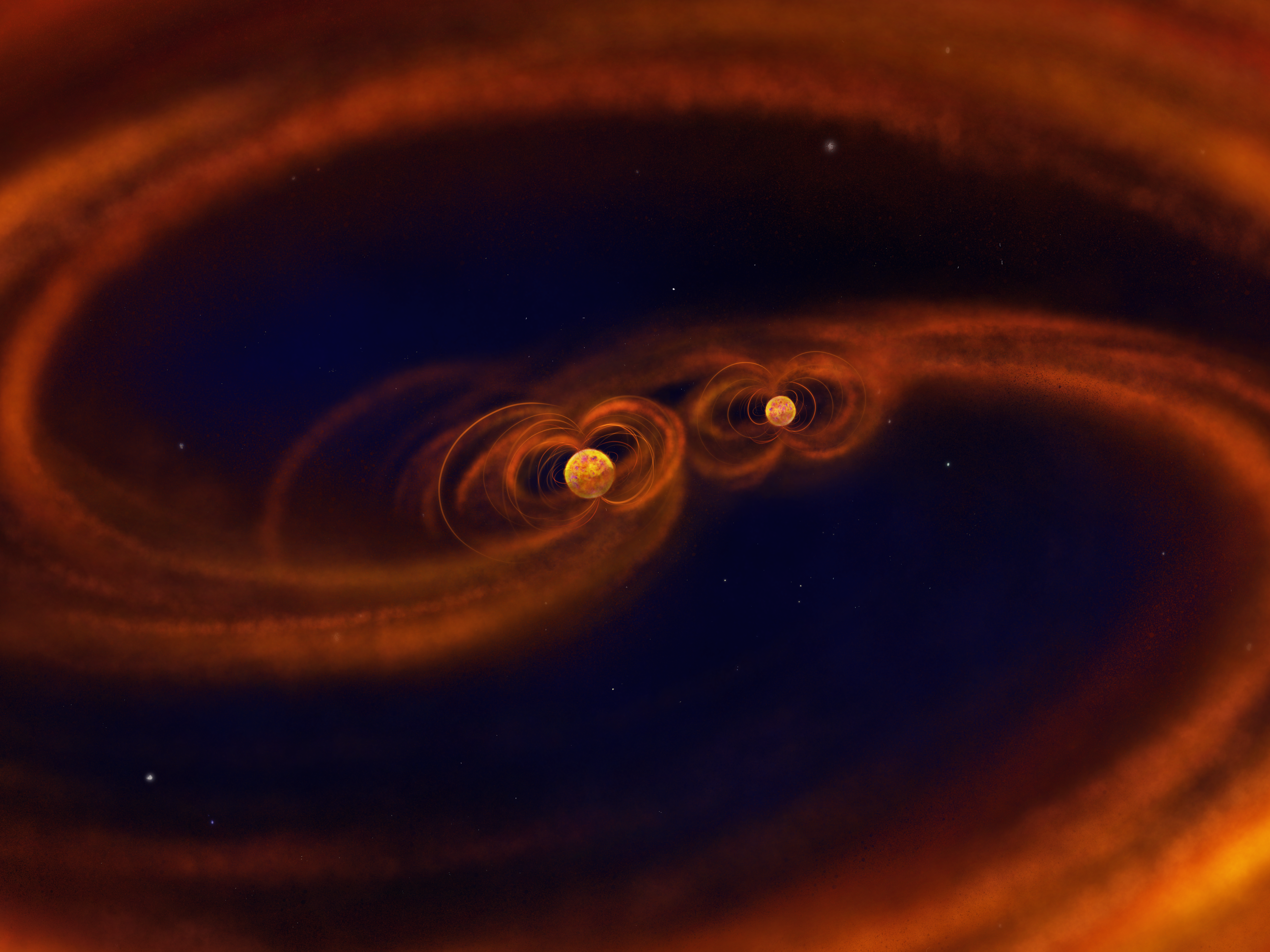
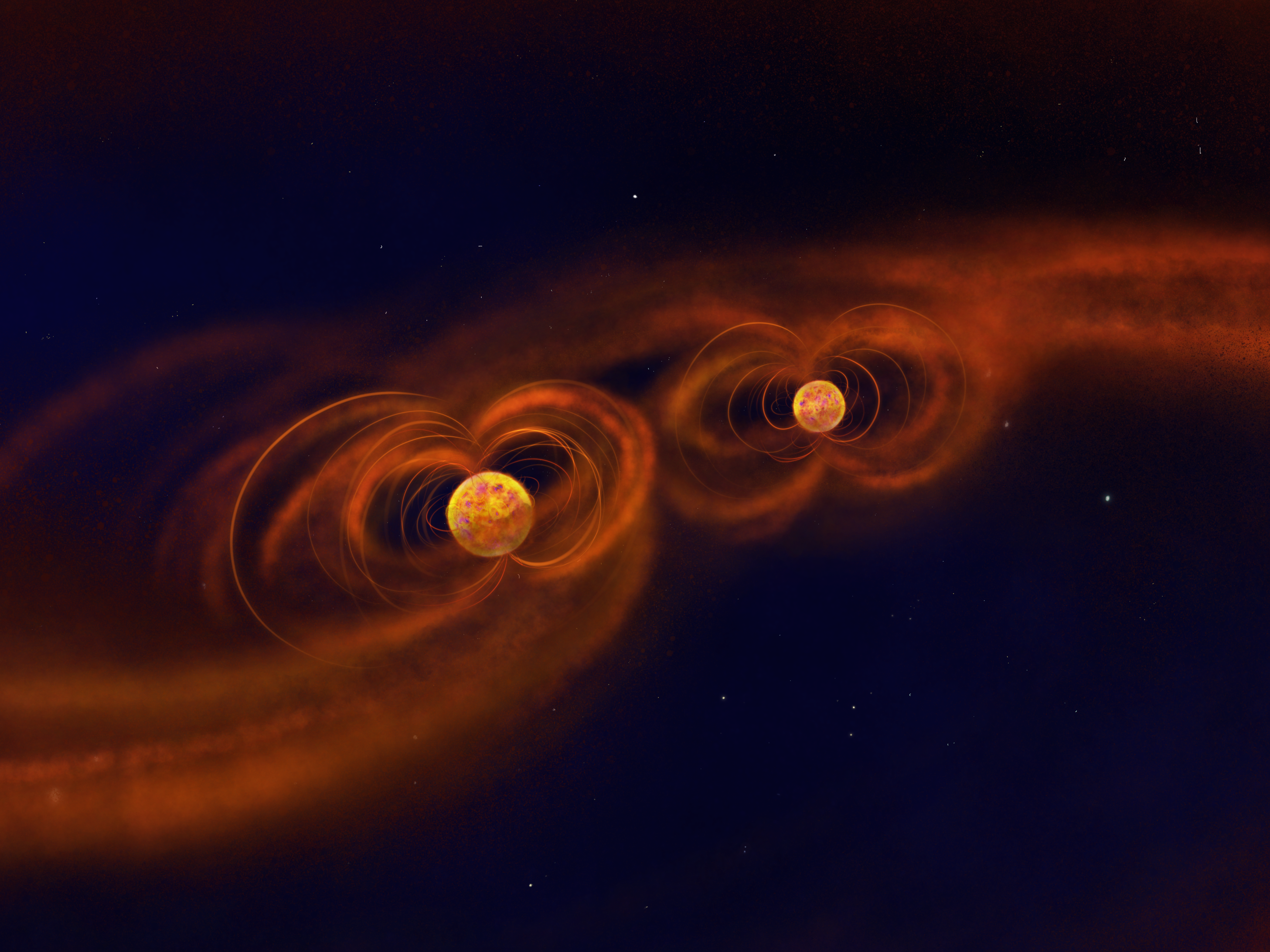
Near the end of my PhD, I had the great pleasure to collaborate with Lydia Schweitzer, a UW-Madison art major, to create the following images. They are her renditions of the binary systems I studied for my thesis. They depict a pre-main sequence binary accreting material from a circumbinary disk. A simulation that helped inform these images can be found here. It was an amazing experience working with her and I can’t recommend the exercise of communicating your science in this way enough – it was a blast! If you’re interested in working with Lydia, you can find her contact info here.
“Real Art”
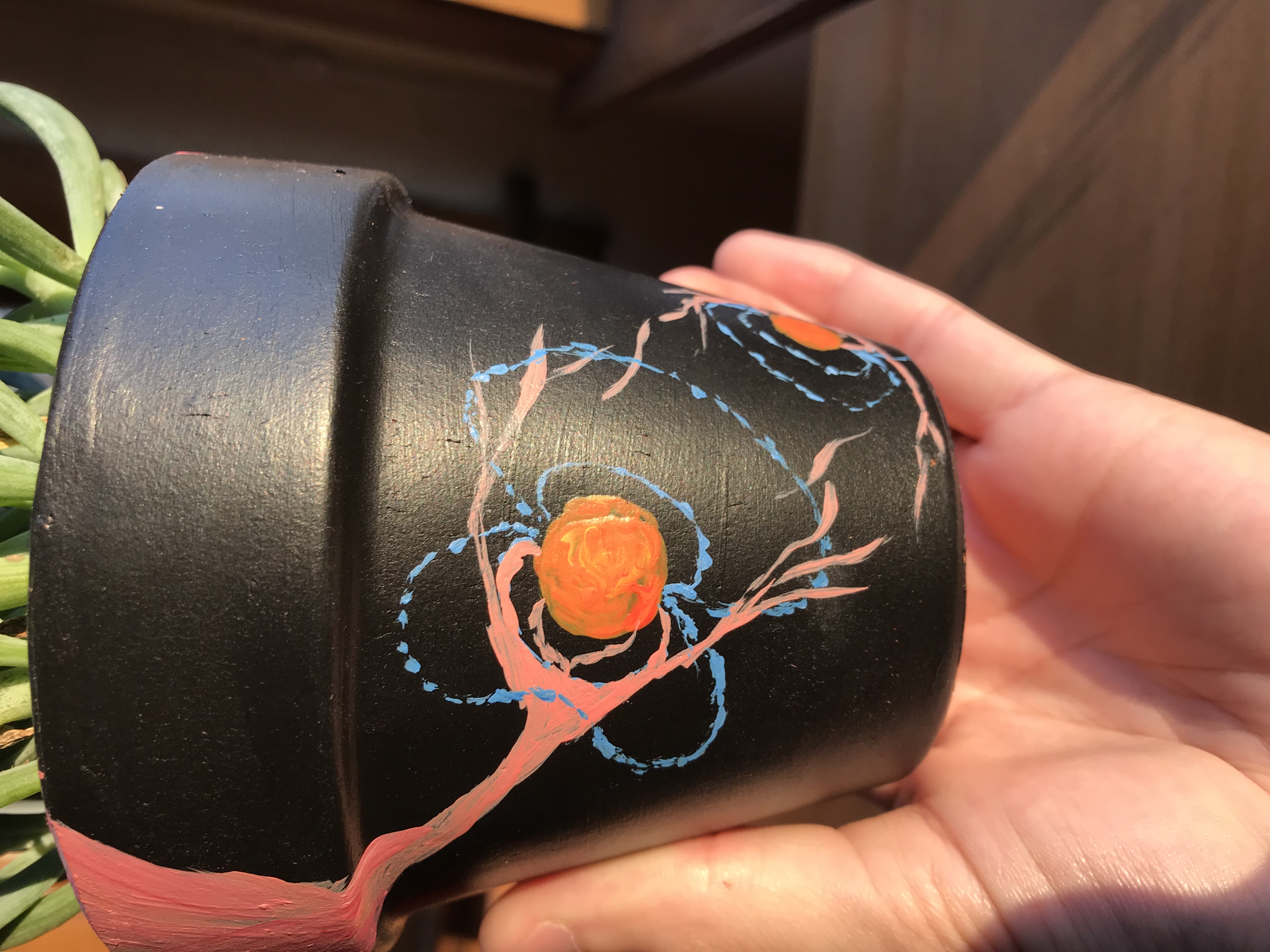
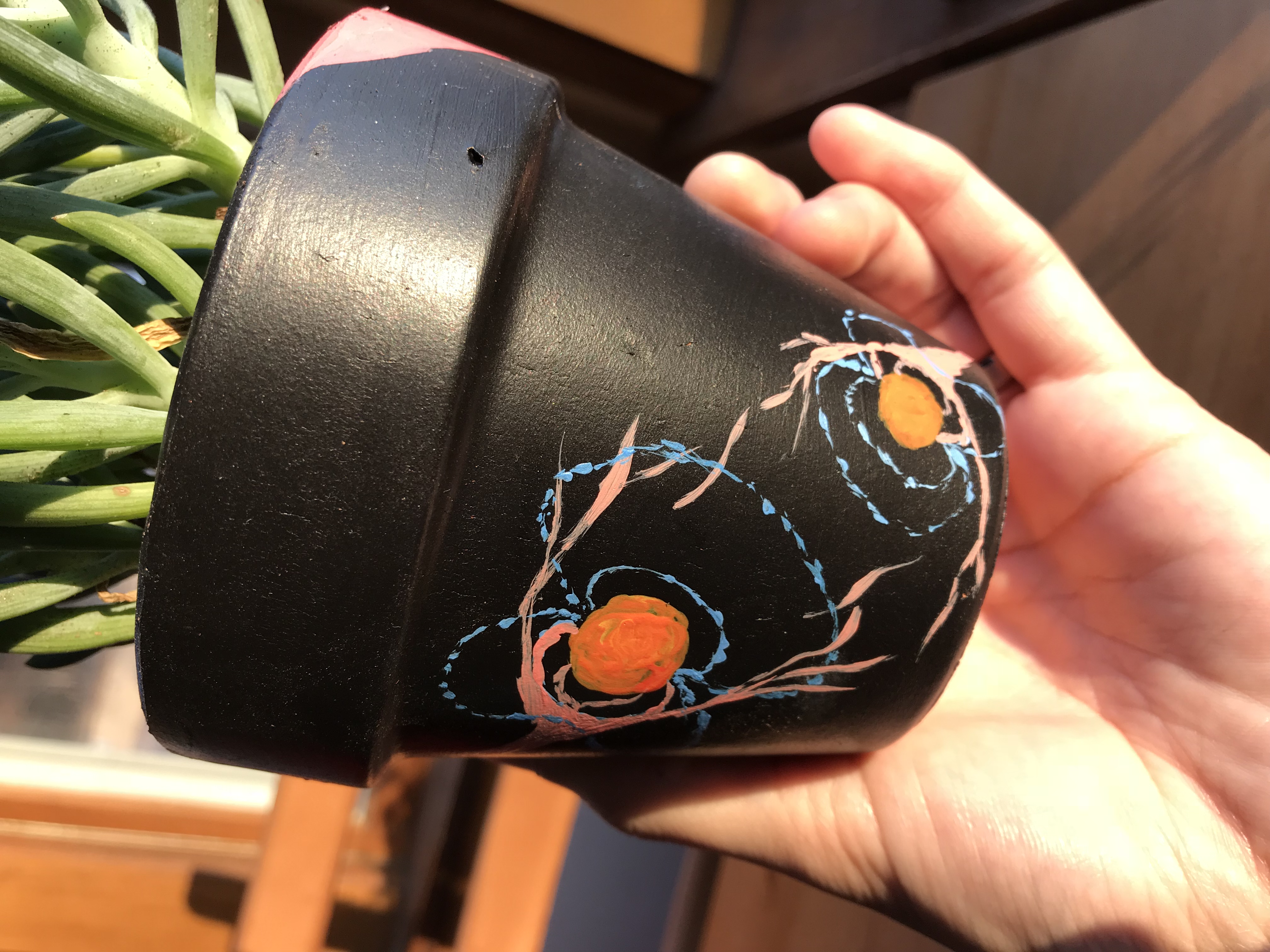
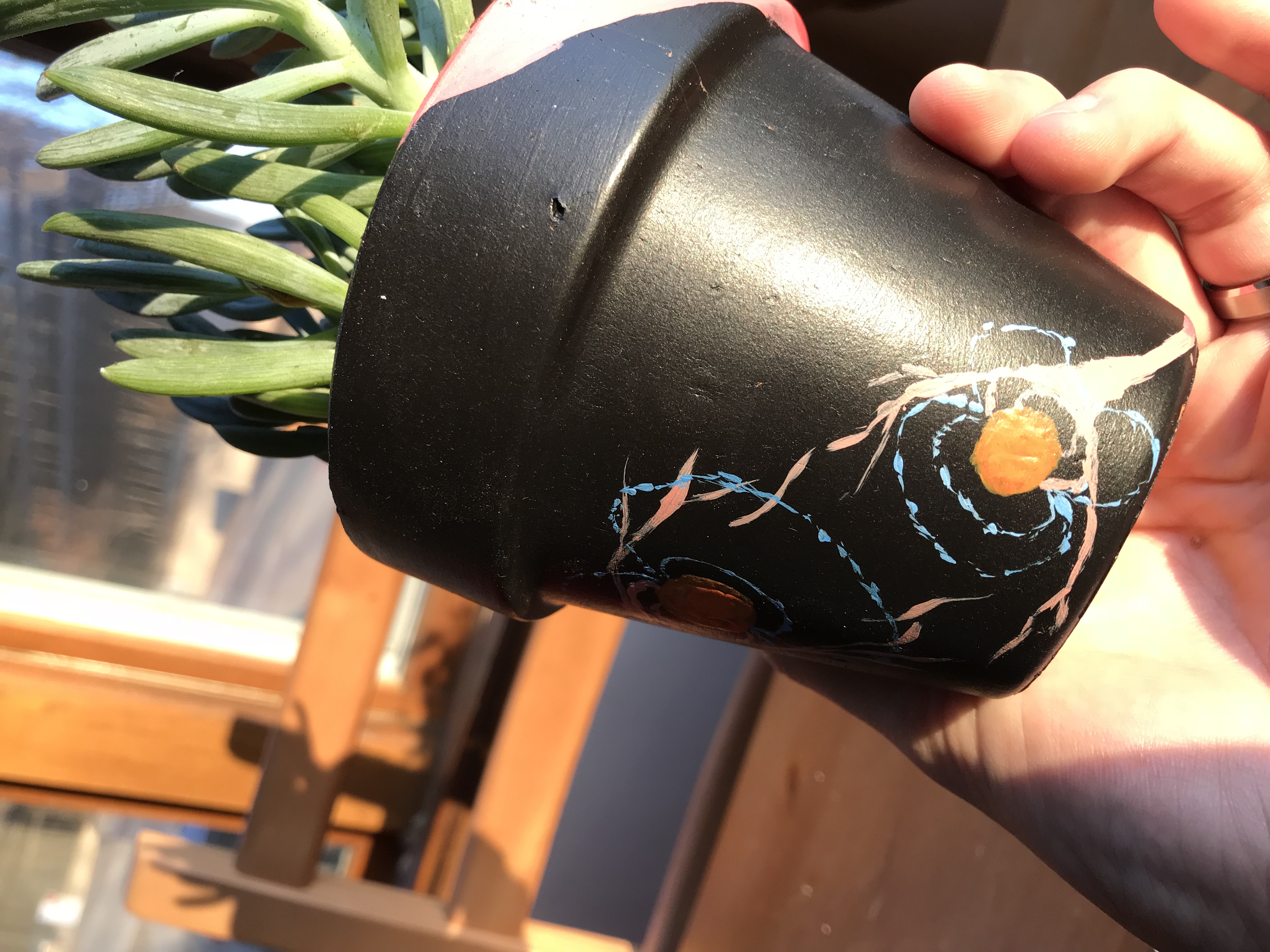
I painted this flower pot to depict the interaction between circumbinary accretion flows and the magnetic fields of the central stars. Why did I choose this medium? For a while, the UW-Madison Rathskeller (the location of our department happy hour) had a Free Art Friday program. This pot just happened to be the provided canvas when inspiration struck.
Unknown Pleasures
While working on the last chapter of my thesis, I spent many months staring at time-series spectra. After making many variants on the same plot, my then office mate and plot consultant, Stephen Pardy, mentioned that my plots reminded him of the Unknown Pleasures album cover by the band Joy Division. “Joyplots,” or ridgeline plots, have become popular in the last decade or so for comparing distributions. So I decided to make my own version from a Calcium line (Ca II K – 3933.7Å) observed in the T Tauri binary TWA 3A. Fun fact: the Unknown Pleasures album cover has an astronomy origin on its own. It is a color-inverted image of a plot from Harold Craft’s PhD thesis on radio pulse profiles. The original is for the pulsar CP 1919. 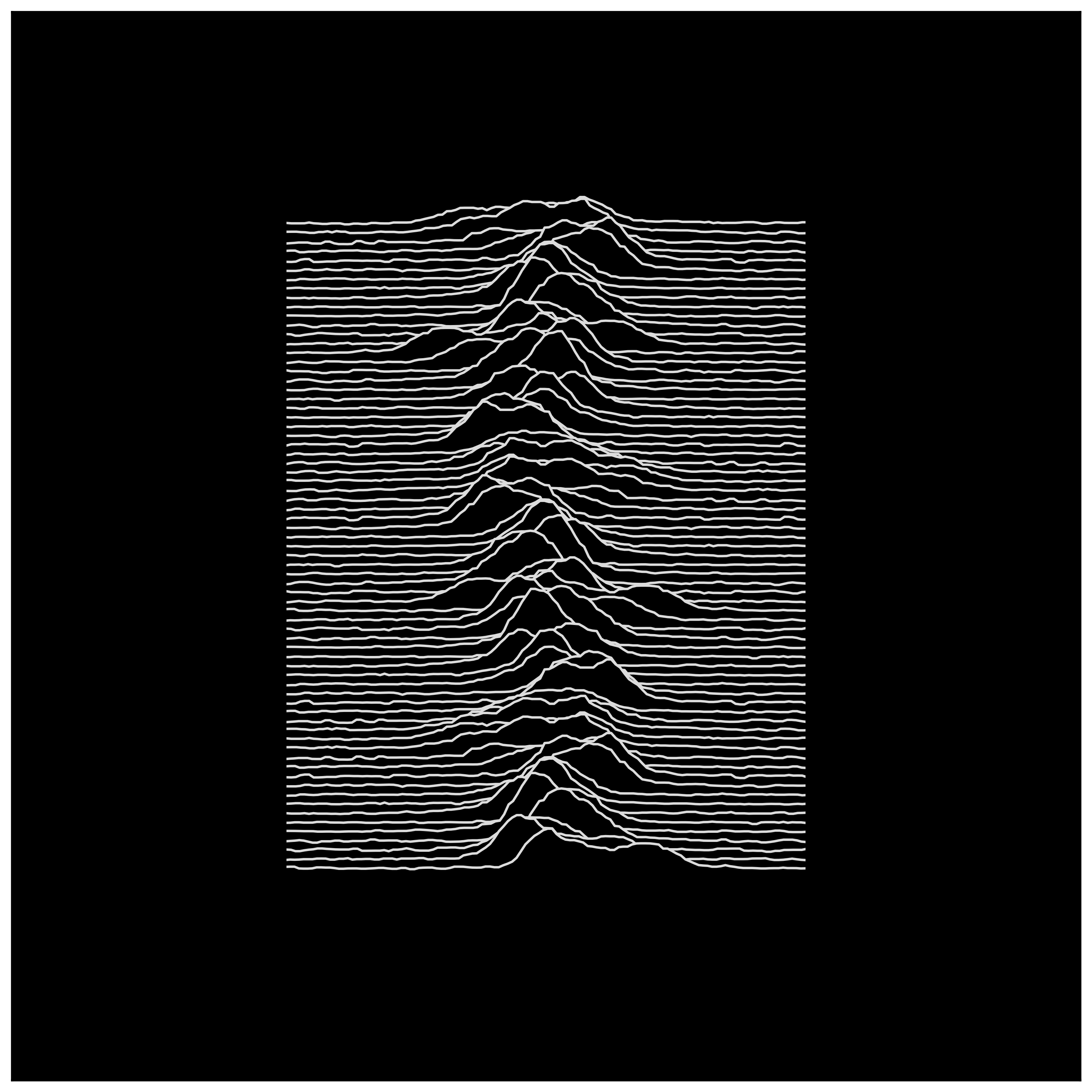
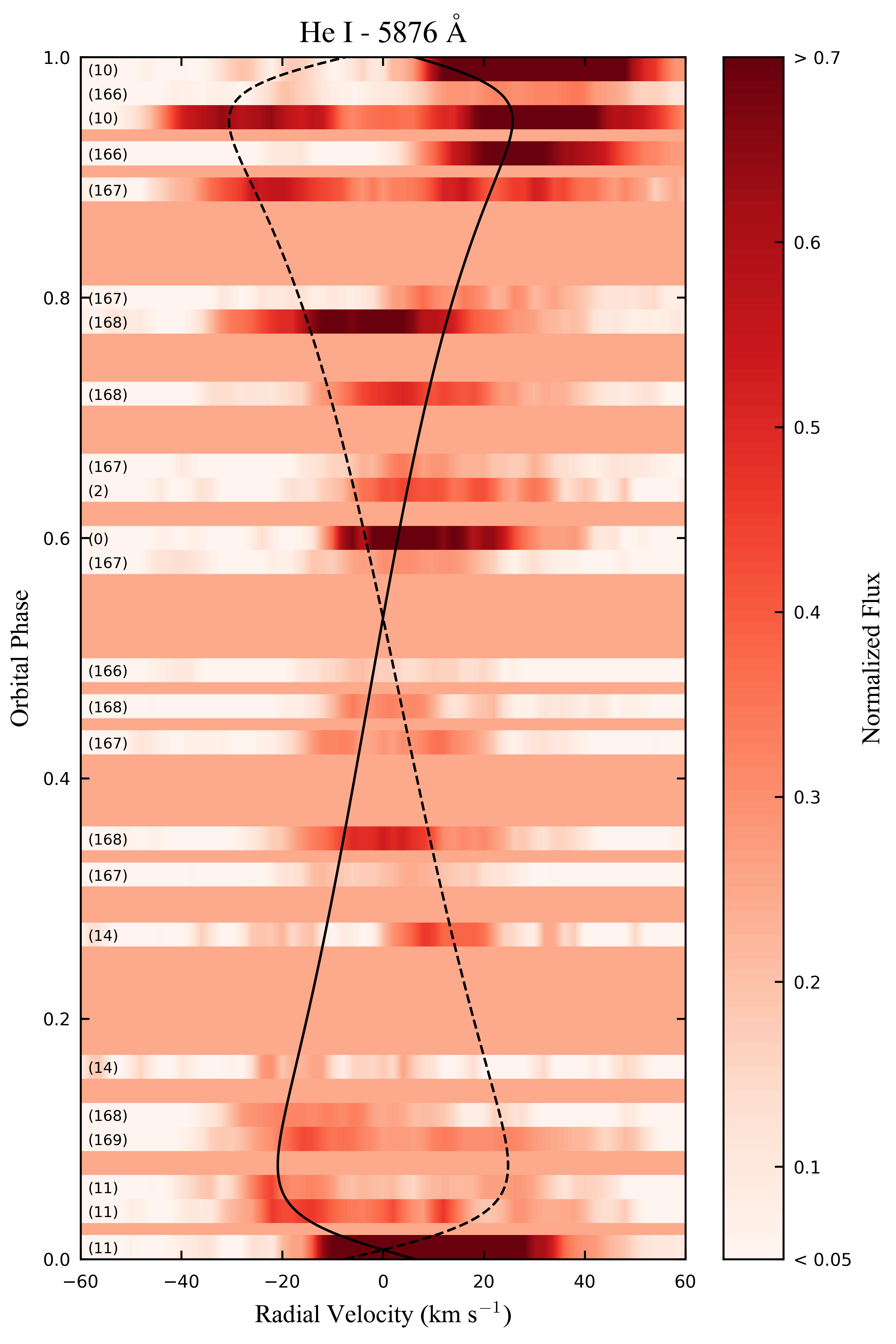
A Poor Man’s Doppler Tomography
Sometimes you make a cool plot and it doesn’t get published. This is an attempt at doing doppler tomography with some observations of the He I 5876Å line from the T Tauri binary TWA 3A. The plot shows emission that, after removing chromospheric contributions, should only result from accretion shocks. We find that the emission typically falls at the primary star’s radial velocity (the solid line), which we interpret as a higher accretion rate onto the primary. This didn’t end up being the best way to visualize these data, but I thought this was an interesting, aesthetically pleasing plot that needed a home somewhere more visible than the depths of my hard drive.